Heading up creative content for Coloro, Joanne Thomas joined from global trend forecaster WGSN, bringing with her insight into future thinking. After studying Womenswear Design at university, Joanne went on to work with both luxury and high street fashion brands, collecting a variety of design and consumer knowledge which she now brings to the Coloro team.
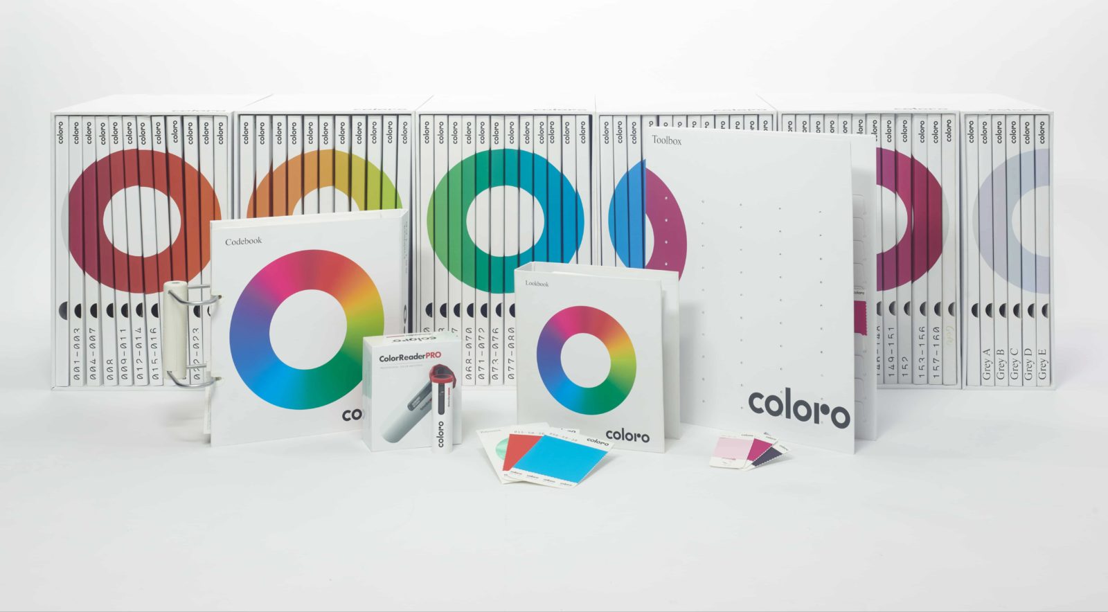
Coloro in Joanne’s words: “Coloro is a truly universal color system that changes the way people work with color. An intelligent, logical color system that makes color decision-making accurate and fast, Coloro will save you valuable time and money and increase your speed to market.”

Read on for our interview with Joanne.
Datacolor: Why is color important?
Joanne Thomas: Color is so important as it touches everything and everyone. It is a primal, primitive language we are all born fluent in. Able to uplift us or depress us, the power of color should never be overlooked. Even in the past, color was held in high esteem, being used as a way of therapy. Blue known to soothe illness and treat pain and red used to stimulate the body and the mind.
Now, color is a form of escapism and recently signified defiance in the face of an all too ungraspable world. Color is at the forefront of design. it has never been more important for brands to pick the perfect shade.
DC: Do you remember when you first learned how complex—and impactful—color can be? What was that experience like?
JT: I think it was when I started Fashion Design, at university, and began to truly understand that a change in color could completely alter an outfit. I had to learn how to create captivating color combinations that would bind a collection together. Choose the wrong shade and that would throw off the entire look.
Never before had I realized the impact. Color theory and education was lacking in both school and university and I think it is often forgotten how important it is. I didn’t understand the concept of colors sitting in harmony and how critical that would be to fashion a cohesive and attractive collection.
 DC:
DC: How do you think about color now, compared to before you started working at Coloro?
JT:I feel like color is constantly evolving. I had no idea about the science behind color and never explored the more technical side that goes into achieving the perfect shade. My experience was restricted solely to the fashion industry and now, working with Coloro, I have had the privilege to explore and understand other industries and how they work with color.
I have also witnessed how excited people get about color and how varied the option is on different shades and tones. I feel incredibly lucky that my job is focused around such a varied and emotive topic. Who wouldn’t love talking about color all day?
DC: Personally, I find it so interesting that there’s a complex science to color, but the end consumer doesn’t need to know about that science to be influenced by it. How do you think about these two very different experiences with color?
JT: When you do not fully know the complex science to color, I believe you view it solely in an emotive way. You experience color by how it makes you feel, what memories are attached to certain colors and which colors are of the moment. However, once you begin to explore the science of color, it removes the emotive side of things, slightly, as you realize that color is just light translated by your brain and it can change depending on the substrate, light source and on the viewer’s eyesight.
DC: What industries have you come across where color plays an important role—from the expected to the unexpected?
JT: I believe now that color plays an important role in every single industry. From the automotive industry which starts making its color selections five years ahead of production, to advertising where a wrong color can make or break a logo, to interior design where get the wrong shade of yellow in a room and the visitors will be hit by a feeling of nausea.
I now feel there is no unexpected industry as more and more people begin to understand the power color can have in a purchase decision.
 DC:
DC: Is there anything that surprised you about the importance of color?
JT: For some industries I was surprised by how many different substrates they need to try to achieve the exact same hue. For example, architects are looking to be able to achieve the exact same tone on woods, metals, plastics and sometimes carpets. This is extremely challenging as each material will react so differently to the dye.
DC: Can you imagine a world without the ability to scientifically control color?
JT: It would have such a huge impact on all industries. They would have no color consistency across any of their products or continued styles, colors would change completely depending on the materials and light sources used.
DC: For those who work with color professionally, how important is it to understand the history of color methodology as well as the science and technology behind it?
JT: The history of color methodology is interesting to show how challenging it is — and was — to find how the brain responds to the ‘illusion’ of ‘seeing’ color. It can also show how our relationships with color have evolved over time and how connotations attached to certain hues evolve as time does. For example, how blue was reserved solely for paintings of the Virgin Mary in historic times, as it was so expensive to produce – and now it is one of the most widely used and acknowledged colors.
Some basic color science can go a long way to ensure designers always keep in mind how various elements effect our perception of color – especially changing illuminants.
DC: What would you say to someone who thinks that color isn’t that important?
JT: Simply look around them and see how color touches and impacts everything they see, everyday.
 DC:
DC: For anyone new to color science, what do you recommend that they do first to set themselves up for success in working with color?
JT: Designers should perhaps look back at the situations where the colors were not as expected, and learn about how and why this was the case. Colors appear differently on your screens, under certain lighting, and on different materials, so it’s important to understand this before starting a project.
Success will come quickly by appreciating that color does look different in these different environments – and to understand and know the limitations in each.
Understanding metamerism, color inconstancy, can be a big problem – and that not all colors will translate or appear the same in all mediums and substrates is a great start. In some ways they should know what to ask and how to question their in-house supply chain teams – or mills – depending on who helps them deliver color.
Thank you to Joanne Thomas for sharing your knowledge and advice on color. Learn more about Coloro’s work here.
Disclaimer: Coloro is a partner of Datacolor. The views, opinions and insights expressed by Datacolor guest bloggers are those of the authors. They do not inherently express the views of Datacolor and our employees.


